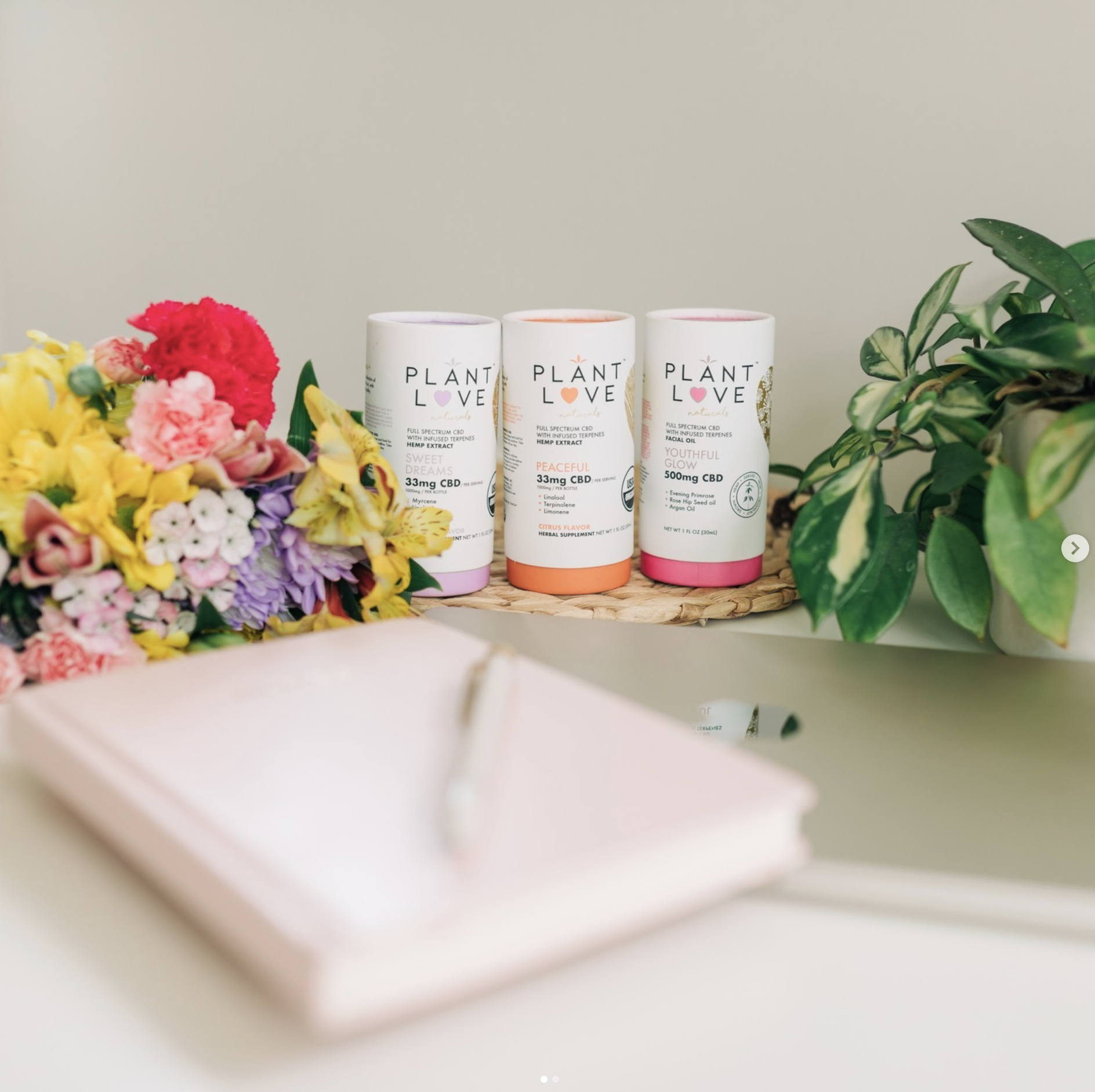
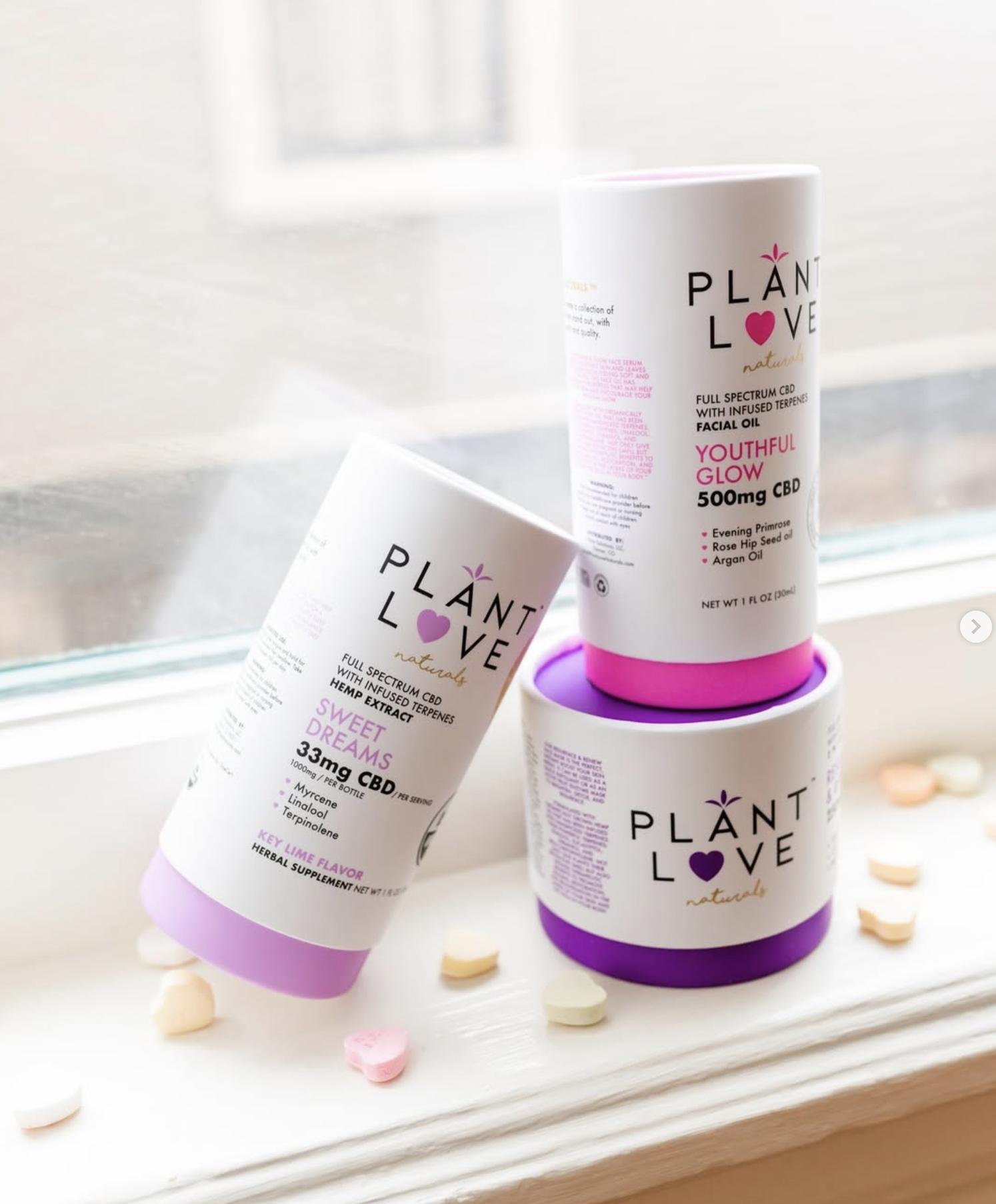
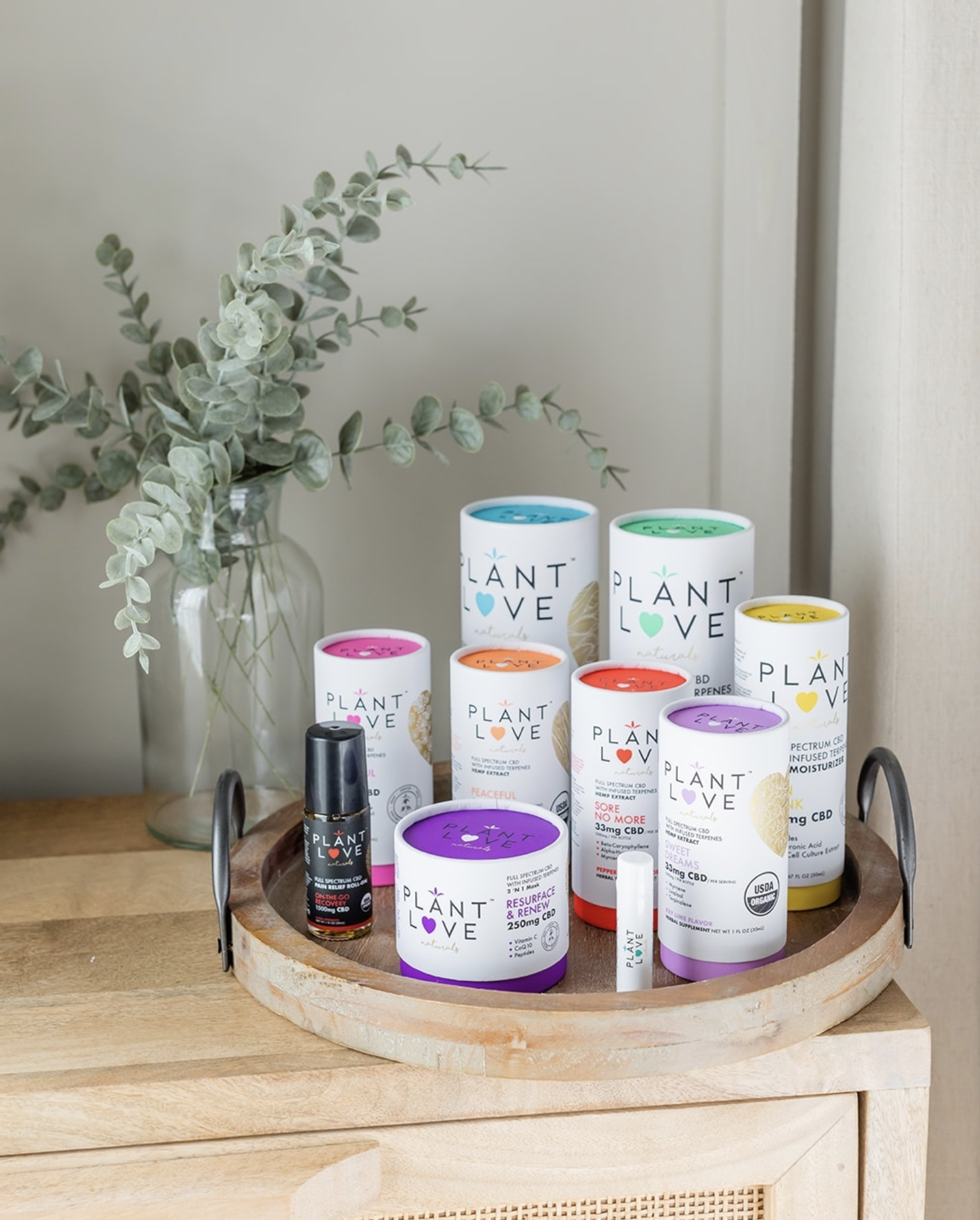
Designed as a system, not a series of one-offs. Defined rules for layout, typography, and color allow new products to launch quickly while staying visually consistent. The result is a scalable packaging framework that balances speed, clarity, and shelf presence without compromising brand identity.


This project focused on the evolution of a modular packaging system designed to support frequent product releases while maintaining a consistent and recognizable brand presence.
The system was built around defined rules for layout, hierarchy, typography, and color usage. These constraints allow each product to feel distinct while remaining clearly connected to the broader visual language.
By prioritizing structure over decoration, the framework supports growth without compromising clarity as the catalog expands.
Rather than treating packaging as isolated designs, the work emphasized speed through consistency. A repeatable framework allows new products to move from concept to shelf quickly without rethinking the visual foundation each time.
Packaging layouts, artwork direction, and hierarchy were designed to work together as a single system. This ensures every release feels intentional and aligned, even as timelines compress and product volume increases.
The result is a packaging ecosystem built for momentum, not maintenance.
Brand architecture
Packaging hierarchy
SKU logic
Visual frameworks
Release consistency
Shelf impact
Packaging layouts
Artwork direction
Typography systems
Color systems
Format variations
Production assets